2021
A clean new visual identity system for the leader in decarbonizing fuel
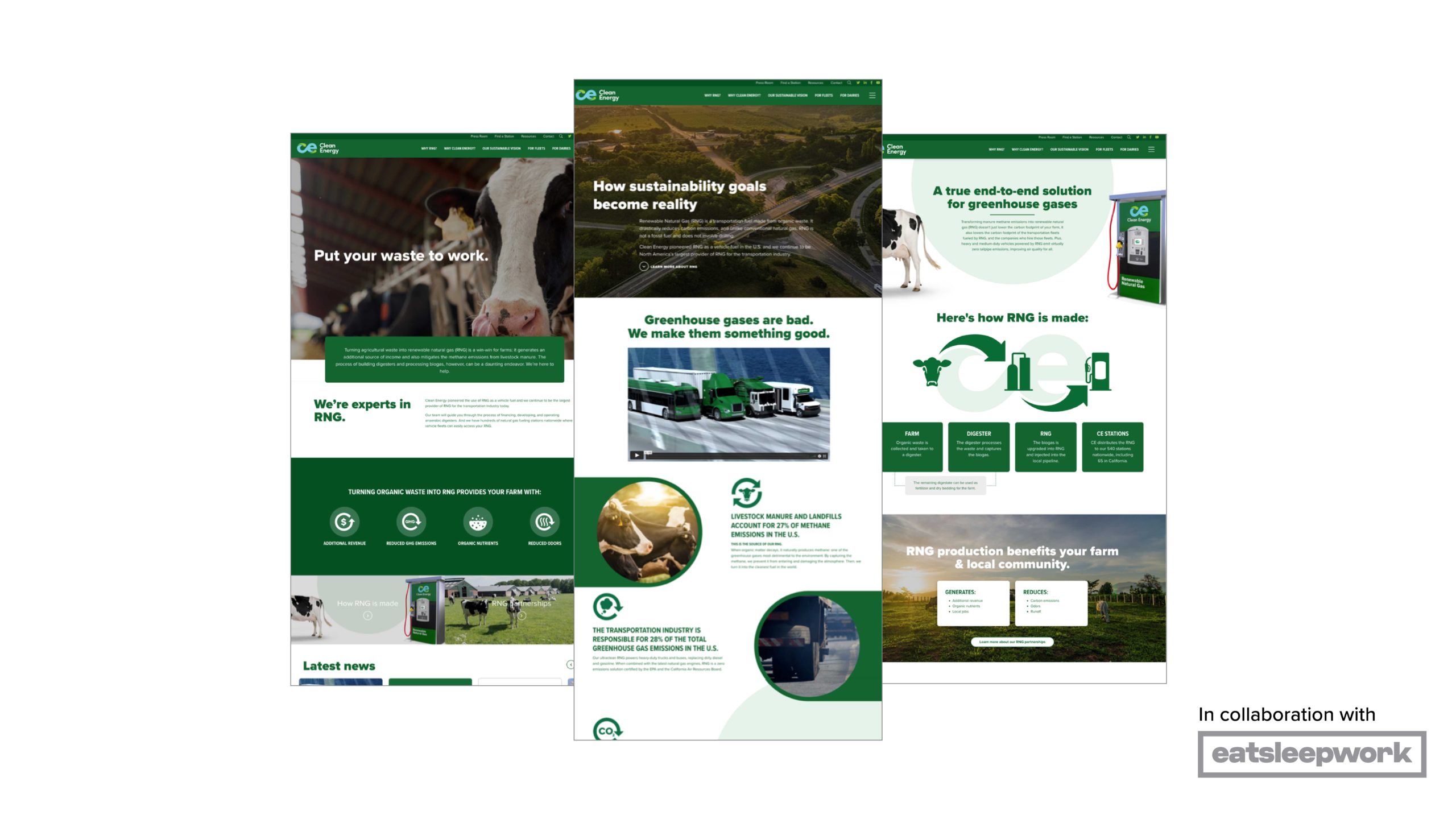
Clean Energy
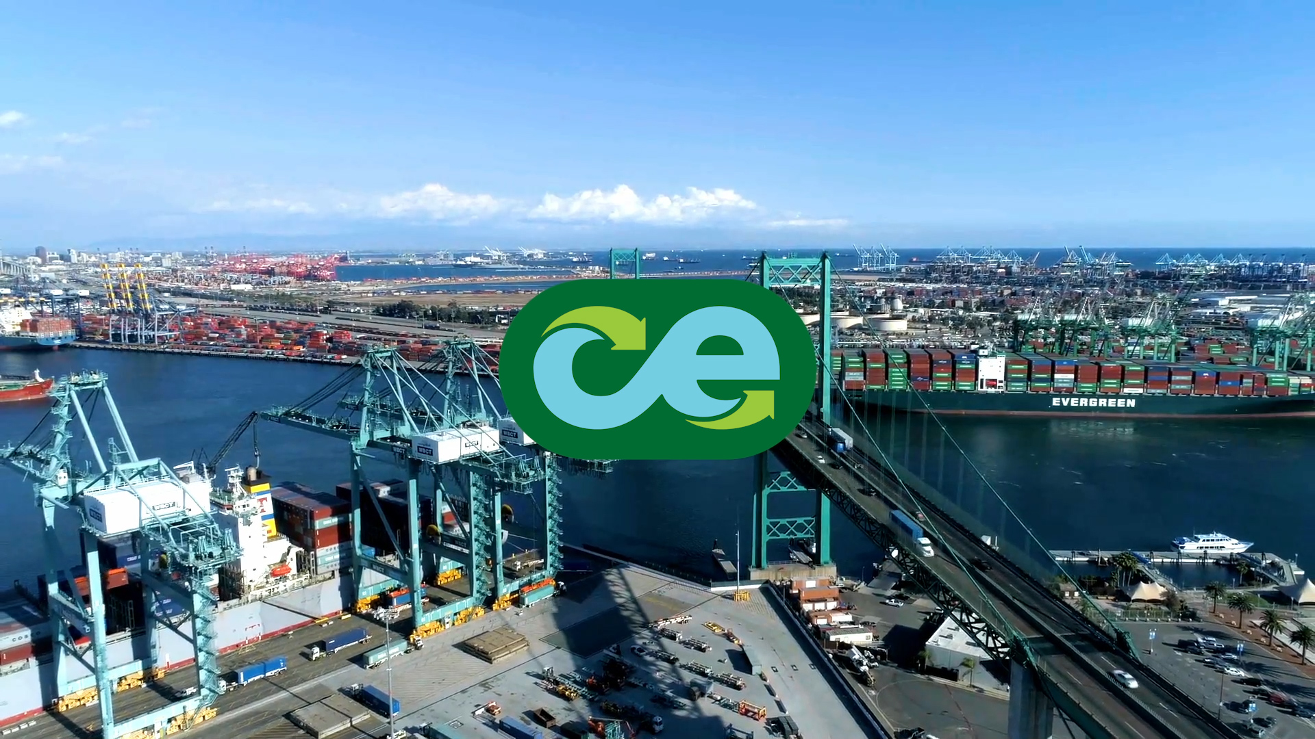

In 2021 Clean Energy decided to reposition the company around its renewable natural gas (RNG) offering. As the largest provider of RNG for the transportation industry, Clean Energy helps customers achieve their carbon reduction goals by turning greenhouse gas into renewable vehicle fuel. We were entrusted to rebrand Clean Energy to align with their new positioning.
We developed a new logo and complete visual identity system that reflects Clean Energy’s commitment to a zero-carbon future.
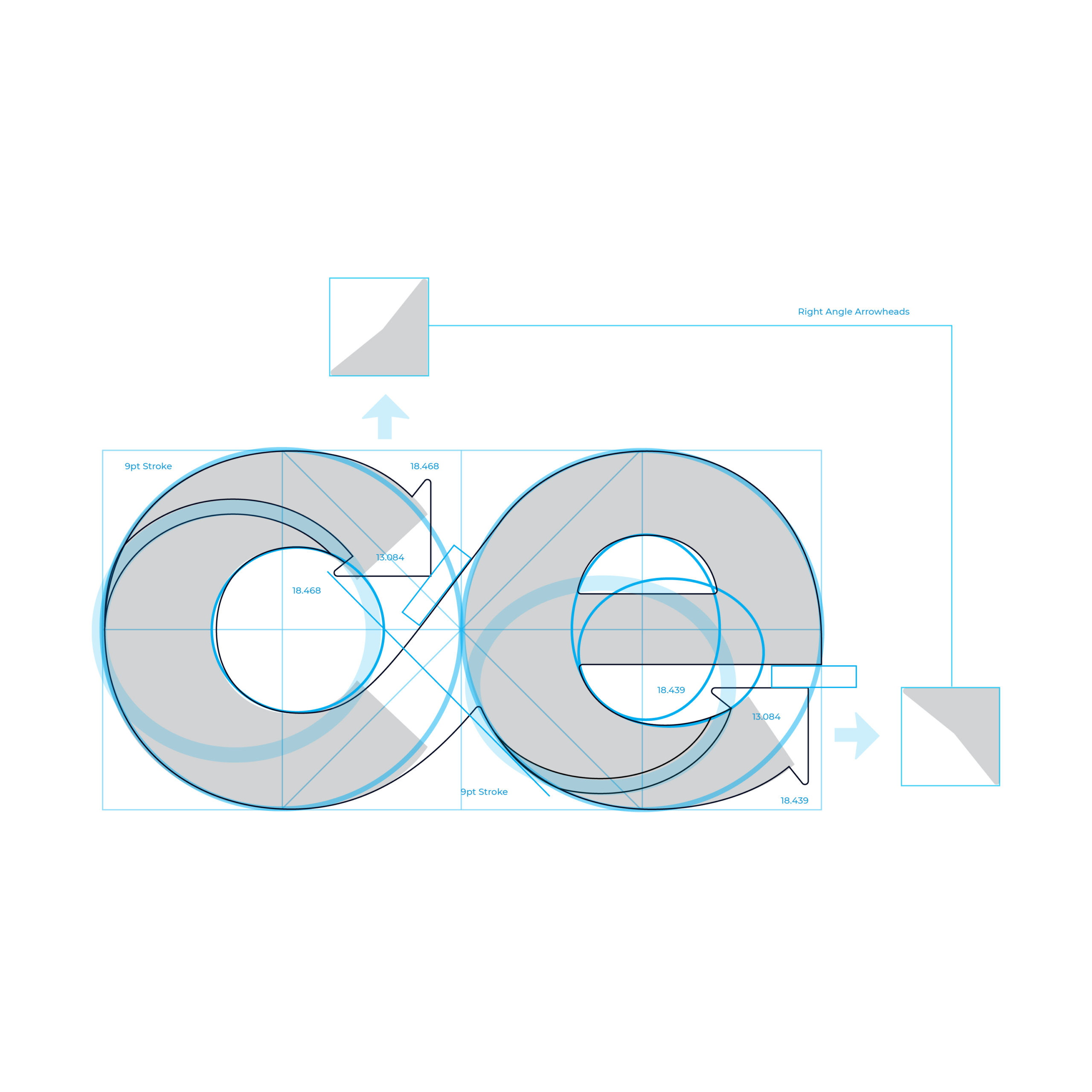
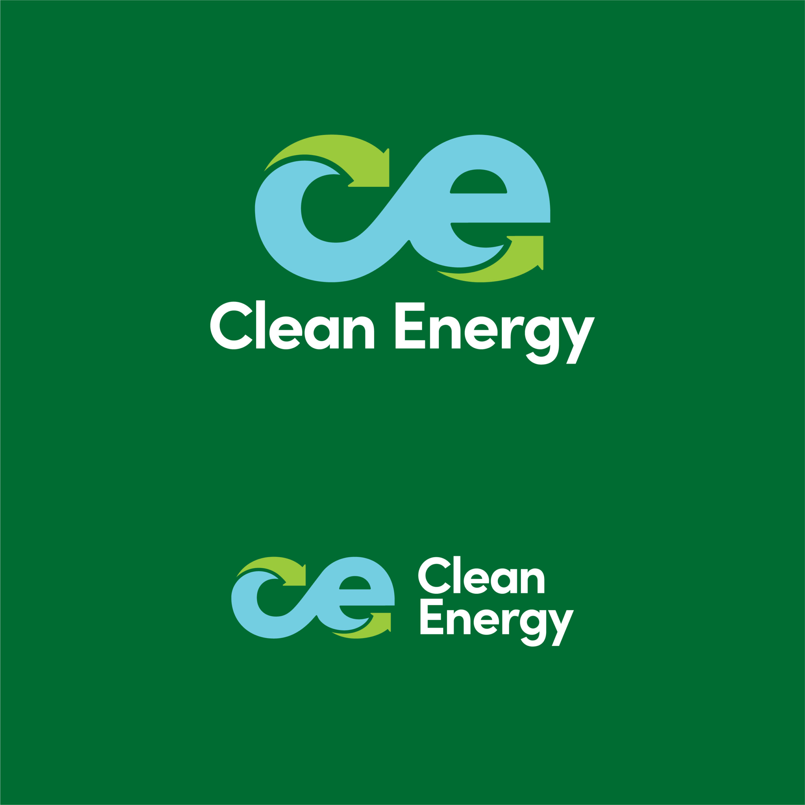
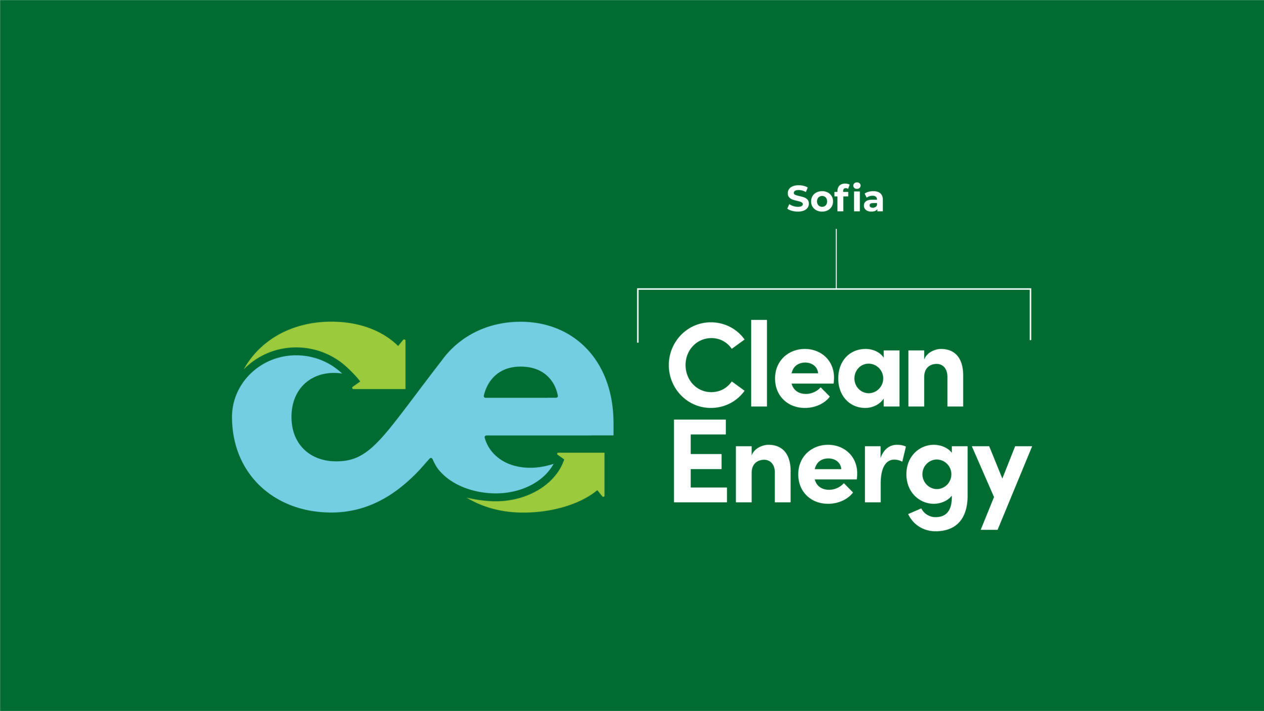
The inherent symmetry of the lowercase “ce” evokes the infinity symbol and ties in perfectly with Clean Energy’s renewable fuel solution.
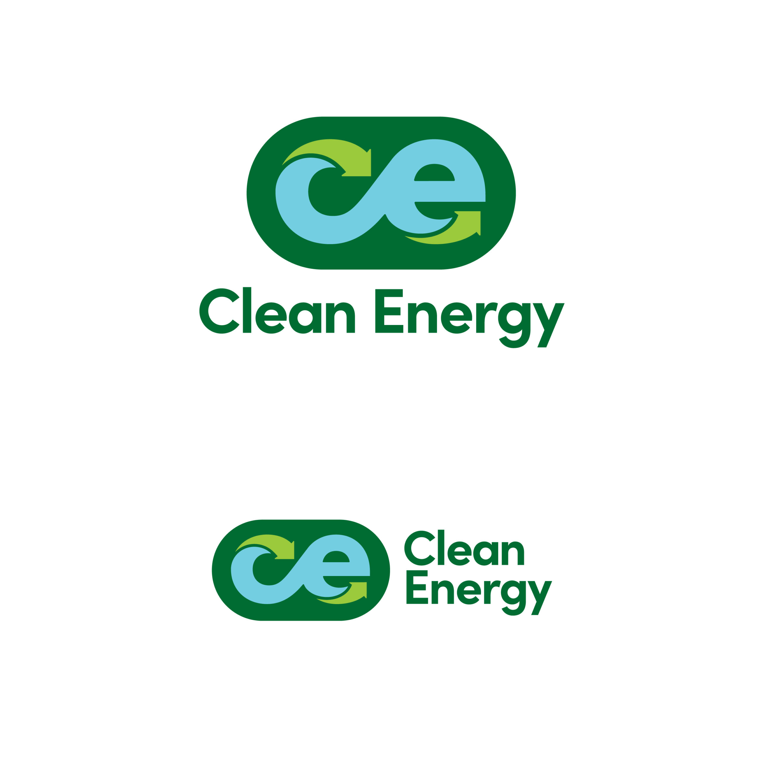
Inspired by classic globes, the use of color takes the logo concept one step further by communicating “earth” and reinforcing Clean Energy’s sustainable solution.
The inherent symmetry of the lowercase “ce” evokes the infinity symbol and ties in perfectly with Clean Energy’s renewable fuel solution.
Inspired by classic globes, the use of color takes the logo concept one step further by communicating “earth” and reinforcing Clean Energy’s sustainable solution.

Conceptually, green represents sustainability and the environment, while blue is associated with clean air and blue skies.
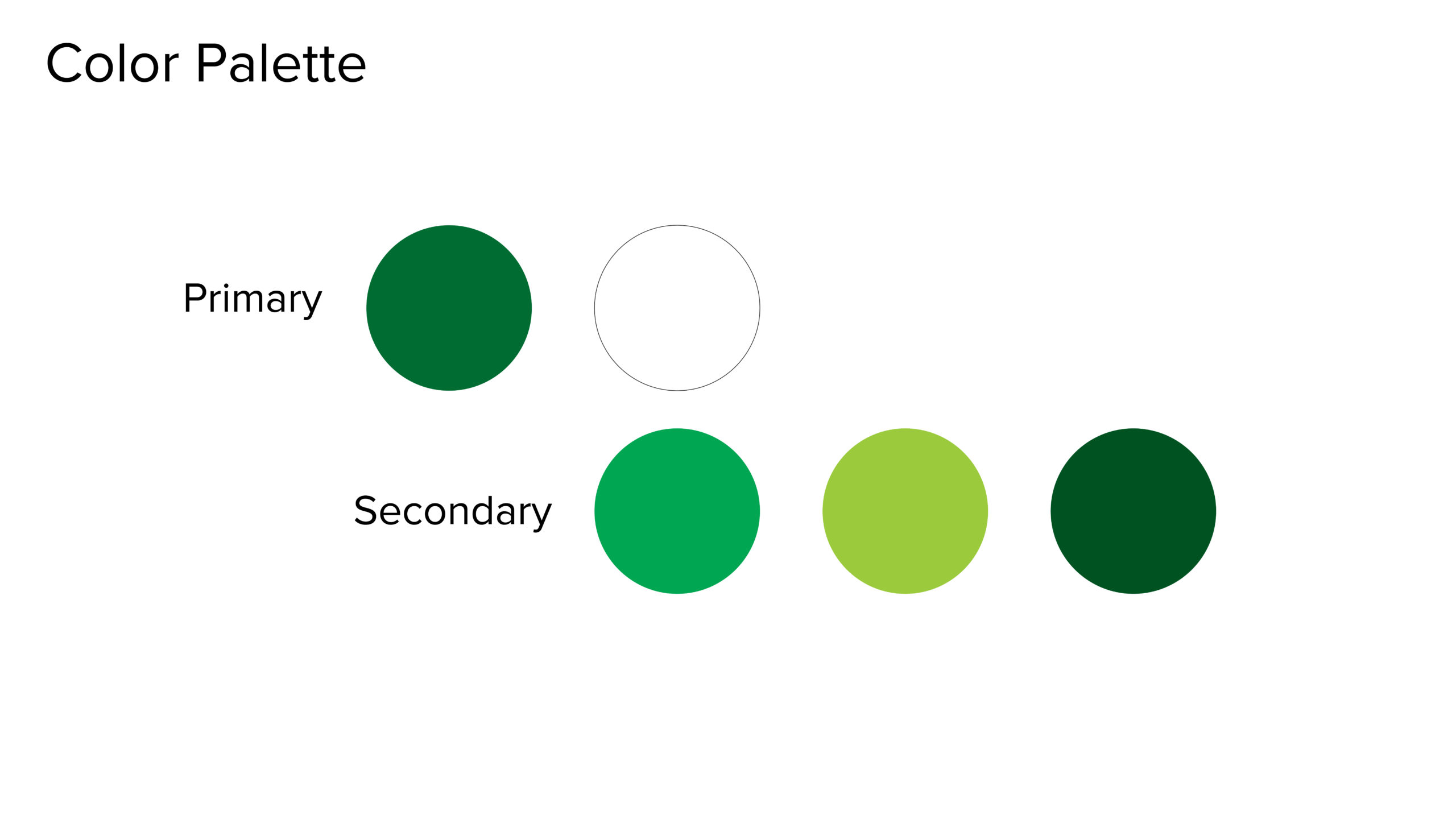
To ensure that our primary brand color read is always green, we limit the use of blue solely to the logo, and rely on additional tones and shades of green for our secondary palette.
Conceptually, green represents sustainability and the environment, while blue is associated with clean air and blue skies.
To ensure that our primary brand color read is always green, we limit the use of blue solely to the logo, and rely on additional tones and shades of green for our secondary palette.
Clean Energy Sizzle
We brought Clean Energy’s brand story to life by showcasing the benefits of renewable natural gas through their new corporate sizzle video.